 September 2018
Contents


Consilience


Signage,
the Face of a City
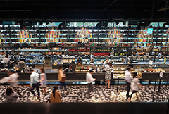
We often see unfamiliar cities in movies or music videos. Buildings, people and streets of the city all contribute to giving much needed context as to where that place might be. In particular, the signage of the buildings and stores provides the ultimate clue. Signs indicate what the place is about, their design, or even the language they use. Unique signage adds personality to a city, as it determines the general impression and vibe. Therefore, images of signs can even provide clues as to the country being shown to the audience.
Written by Lee Eun-yi, designer & writer Photos courtesy of Seoul Metropolitan Government
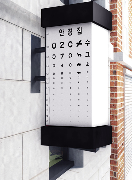
 The sign reminds people of the sky above.
Transformation of Signage: From Simple Display to Sophisticated Design
Signage is the use of a sign and symbols to easily deliver a message for a specific purpose, such as an advertisement. It has been utilized for a long time, for example in ancient times and in the Middle Ages people would display items that would identify with the stores, such as a hat for a hat store, scissors for a tailor, or a shovel for a hardware store. It was only in modern times when people started using letters and symbols on large signs to grab peopleˇŻs attention, displaying them in front of their stores. Today, it has expanded its diversity to neon and LED signs as more technology has been introduced. ItˇŻs estimated that Korea launched its concept of signage in the early 1900s, as records show an early newspaper, The Korea Daily News, with advertisements of company signs in 1909. In 1922, it was so overused that the government had to regulate it. These regulations are still in effect today under different terms since signage is important enough to define the personality of a city.
 Like in old times, some places still use the items to identify their store.
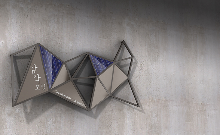 Dimensional shape of the sign intrigues people. The shadow it creates underneath is also interesting part of the design.
What Makes a Good Sign?
The essence of putting up a sign is to look distinctive among the many other businesses nearby. Any business owner would want to catch the eye of people passing by. They wouldnˇŻt want their ads blended into other countless stores with boring designs. However, their desire to make it unique has turned out to damage the aesthetic of their surroundings.Therefore, since 2006 city governments in Korea have been exerting efforts to beautify the city by polishing up signage standards. There are three things that constitute ˇ°good signage,ˇ± according to city governments: uniqueness, aesthetic and harmony. That is to say, good signage means that it has to have its own unique color that would distinguish it from others, and be aesthetically appealing, and be in harmony with the surrounding environment.The current trend among signs lies not so much in how extravagant they are, but more in their reserved beauty. With that in mind, itˇŻs not hard to find signs with simple, highlighted letters with no distracting background images. Also, this simple aesthetic influences statues and pictures in front of stores, too, which have also become simpler in design. In fact, history tells us that this return to simplicity in terms of what is perceived as good signage is not new. Reporters from a magazine in the 1920s criticized lavish signs and highly praised small signs that were outstanding in quality and harmonious with other buildings. Apparently, the past and present agree what constitutes good taste. Good signs add to the appearance of a city, like a smile on a face.
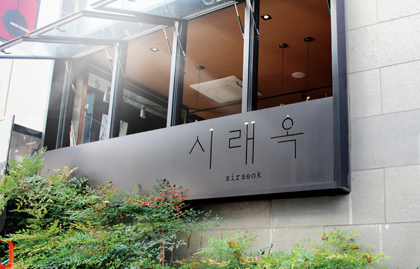 This sign has a minimalistic style with colors that match its surroundings.
Other Articles
Consilience
Application of subscription
Sign upReadersˇŻ Comments
GoThe event winners
Go


