When it comes to K-beauty, the world recognizes ˇ°unconventional creativityˇ± as its strength. But what does originality mean for a beauty brand, and how is it created? The brand strategy of Min An-na, who recently successfully rebranded Fwee, reveals the key to K-beautyˇŻs success.
Writer.
Sung Ji Yeon
Photos courtesy of.
Min An-na
Orchestrating Brand Dominance
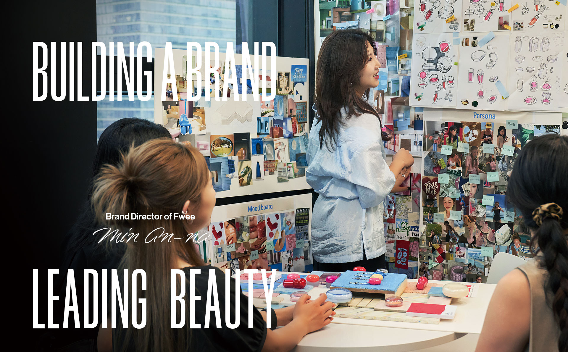
Min An-na is a designer and brand director with 15 years of experience. Min sees brands as personalities. When a customer thinks of a brand, she believes it can be expressed in a clear image, just like describing someone around them. Just as people can immediately describe their friends by saying, ˇ°HeˇŻs cheerful,ˇ± so should brands.
ˇ°There are so many beautiful people, but not many that you can keep thinking about, and the same goes for brands. So, I think a good brand is one that surprises you and makes you come back to it again and again.ˇ±
Min recently led the rebranding of the color cosmetic brand Fwee successfully redefining its identity. Before the rebrand, Fwee had many products and was popular for its cushion compact, which beautifully covers the skinˇŻs texture. The problem was that the brand didnˇŻt have an image that could replace the phrase ˇ°a brand with a good cushion compact.ˇ± In response, Min created a clear and unique image for Fwee.
Forging Brand Distinction
HereˇŻs how Min put together the brand concept. ˇ°Fwee is an exclamation when youˇŻre in a good mood. As soon as I learned the origin of the brand name, a new image of the brand was instantly created. Exclamations are spontaneous, so I came up with the concept of ˇ®colorful moments.ˇŻ I wanted the brand to be associated with ˇ®everyday feel-good moments.ˇŻˇ±
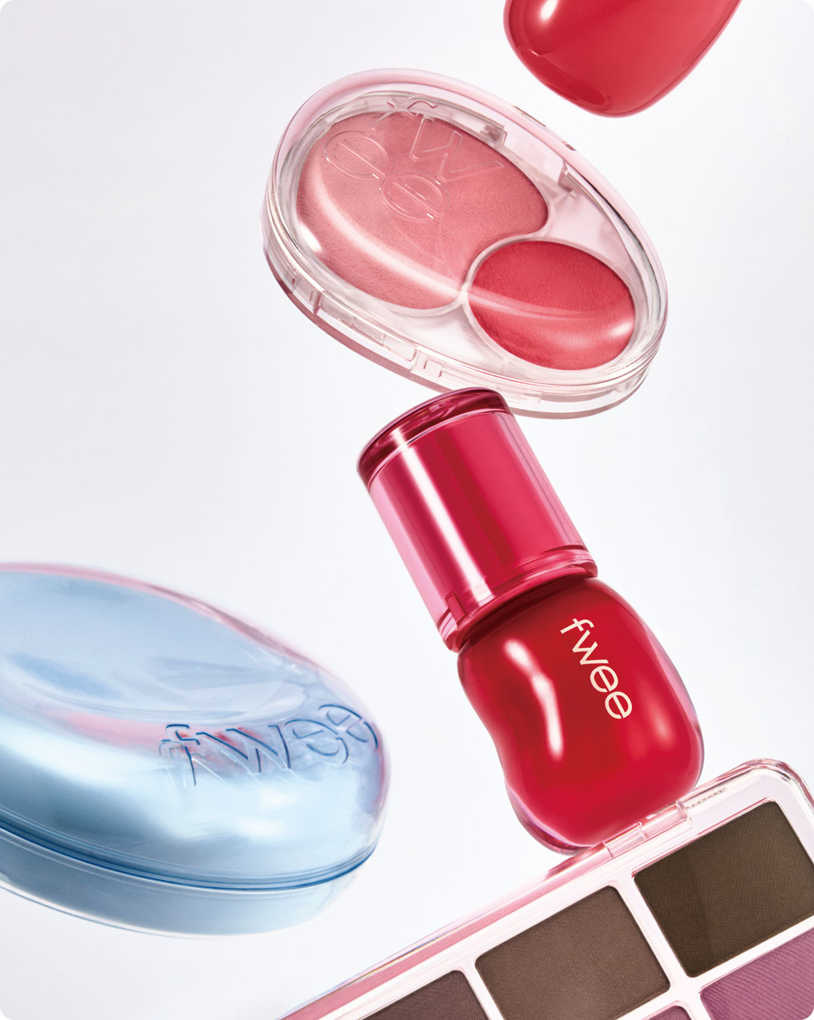
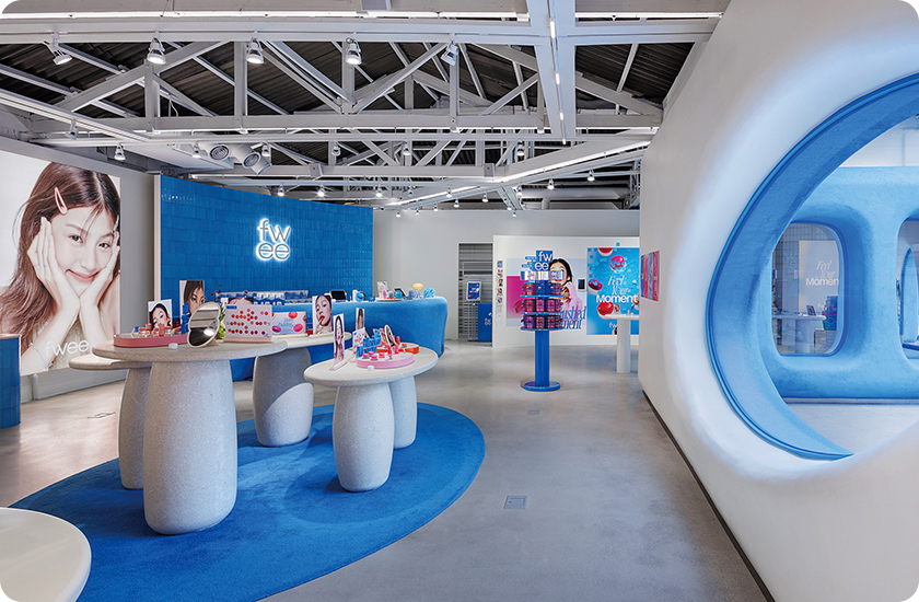
To give the new concept a sense of authority, Min overhauled the brandˇŻs colors, container design and spaces. She aimed for freshness to break away from the ordinariness of the existing brand, but she didnˇŻt want it to be so unique that it felt overwhelming.
The new brand color, bright blue, conveys a feeling of freshness to consumers and stands out as it is not commonly used by beauty brands. The container design was based on an atypical circular shape, evoking an organic form shaped by its grip rather than adopting a specific motif. This made it instantly recognizable as a Fwee product, even without the brandˇŻs logo on top.
ˇ°I paid special attention to the container, because itˇŻs one of the most powerful and effective elements in building a brand image. The reason I designed the container in an atypical circular shape is that I wanted the product to have a soft and round shape overall to convey a pleasant feeling, while also being varied enough to avoid archetypes. This way, when the products are placed together, they can look similar.ˇ±
The flagship store, central to the brandˇŻs identity, is also noteworthy. The exterior, which looked like hand-pressed ceramics, drew attention from visitors. Everything in the store from the product displays to the photo zone was designed to create a fun experience for visitors.
ˇ°Everything in the store boils down to ˇ®unforgettable momentsˇŻ and creates a unique experience. For example, the ˇ®egg fit cover cushionsˇŻ are designed and arranged like food on a dining table. We also have a section where customers can get a small portion of their purchase in a keyring container so they can capture their colorful moments in the store.ˇ±
Min worked hard to find a model who could convey the brandˇŻs concept without overshadowing the brand image. ˇ°The model candidates were beautiful but unrealistic celebrities. I thought they didnˇŻt fit our slogan. I struggled to find a unique model, then found the current model. She has an ethereal charm that makes it difficult to immediately guess her nationality, and when she smiles, you can feel a lot of good energy. Additionally, sheˇŻs not well-known in Korea, so we thought she could really tell the story of our brand.ˇ±
The Future Awaits
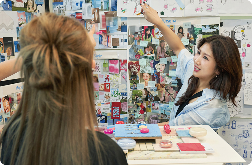
After rebranding, Fwee has quickly become a leading K-beauty brand. This was not only due to MinˇŻs brilliant imagination but also the unified efforts of the entire team. Min only communicated to marketers and product developers the image they should create in the future. It was the employees who deeply understood the brandˇŻs direction and how to implement it.
ThatˇŻs why she wants to guide employees to grow as brand creators who produce compelling outputs. As a brand director, she wants to be the leader of the people who create the brand together. ˇ°I want to be someone who can clearly guide the brandˇŻs path forward and constantly inspire our employees,ˇ± she said.
Min is looking for fresh ideas and new ways of expressing herself while keeping things secure. She wants to set trends rather than follow them.
The same is true at the brand level. The brand is investing more to prepare new products to prevent quality issues. It is also preparing to expand to other areas of Korea and overseas to satisfy customers.
Min has proven the power of K-beauty by using original language and delicate expressions that capture customersˇŻ hearts. There is much to look forward to in the next chapter of Fwee and the future of K-beauty as she continues.
