Trends
Super Simplicity
Reimagining Hangeul
Hangeul, which was invented by King Sejong the Great in 1443, is the phonetically-based Korean alphabet that has drawn acclaim throughout the world for its simplicity and rational nature. The 24 Hangeul characters yield 11,172 possible combinations. Artists and designers nowadays are using Hangeul letters in works and designs. If freed from its preset mechanisms and preconceived notions or biases about its workings, Hangeul can be used to produce a nearly limitless number of esthetic creations.
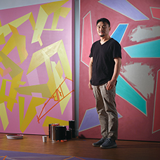
Written by• Lee Yongje,
type designer & professor
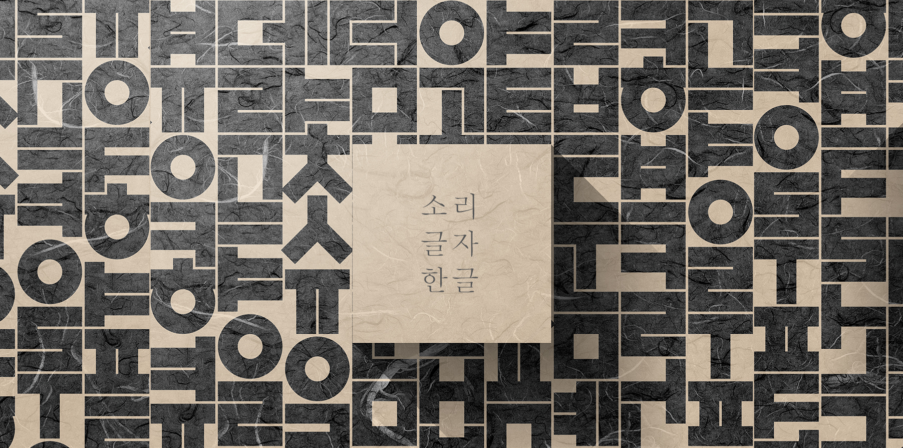
© imagetoday
Hangeul is simply more than a mode of communication. Daily items like bags, clothes and souvenirs at museums and galleries in Korea often feature products inspired by the alphabetˇŻs letters. Visual representations like this convey meanings of sound such as larger-size letters denoting greater volume and vice versa, as well as variations hinging on the style of lines that form a letter or element.
Though the alphabet is enjoying far greater interest than before, its typographic applications are no passing fad. How can people see Hangeul as a visual entity rather than as a linguistic representation or mode of communication? The following explains what makes Hangeul so visually enticing.
Precise Enunciation
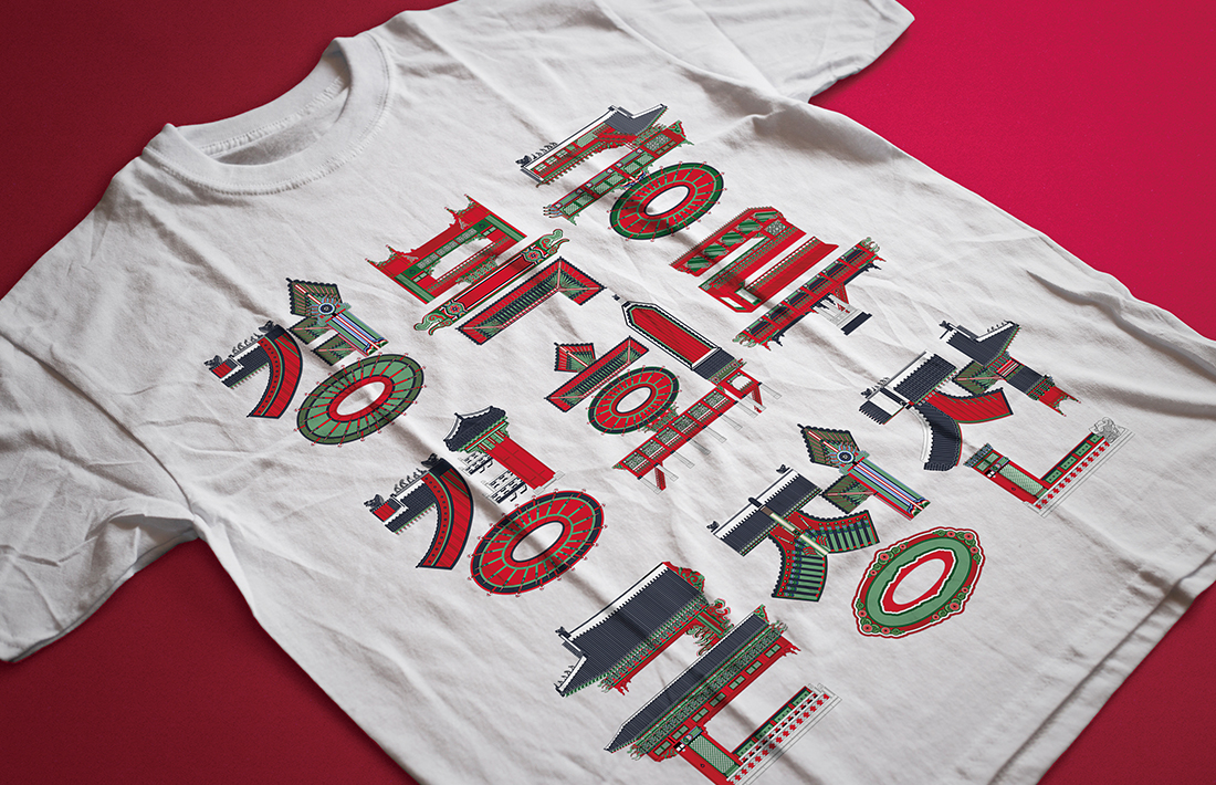
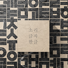
A t-shirt rendering of graphic designer Eugene (Hyun-Woo) NamˇŻs series of national palaces-inspired typographic work. Visit the artistˇŻs Instagram profile @eugene_0219 for more of his work. © 2020 by Hyun-Woo Nam
Hangeul is based on rules corresponding with the literal ˇ°shapesˇ± of sounds required to pronounce them. The elastic nature of the alphabetˇŻs appearance is attributed to its composite nature. To its basic consonants of ¤ˇ, ¤¤,¤±, ¤µ and ¤·, simple lines are added to create the ˇ°strongˇ± sounds of ¤», ¤§, ¤Ľ, ¤¸, ¤ş and ¤ľ. When the number of basic consonants are doubled, they create fortis or the ˇ°tenseˇ± sounds of ¤˘, ¤¨, ¤¶, ¤ą and ¤ł.
HangeulˇŻs vowels consist of line and dot variations. The lines are simply horizontal and vertical and through the yin and yang mechanism, they create variants of ¤ż, ¤Á, ¤Ç and ¤Ë, or the ˇ°brightˇ± sounds or yang, and ¤Ă, ¤Ĺ, ¤Ě and ¤Đ, or ˇ°darkˇ± sounds or yin. Combining these vowel elements produce the combinations ¤Č, ¤É, ¤Ę, ¤Í, ¤Î, ¤Ď and ¤Ň.
These vowels and consonants together create a distinct character, typically in angular framing. Each assembled letter expresses a pronounceable syllable. The assembly mechanism behind each letter logically corresponds to methods of enunciating or converting them into proper sounds. Thus HangeulˇŻs variations are both comprehensible and predictable, especially for the purpose of transferring its legible visibility into auditory form.
For that reason, anyone can follow through the mouth shapes Hangeul embodies to enunciate its basic syllables. In other words, the alphabet is a sort of visual play that evokes inclusivity through its intuitiveness. For those seeking to learn Hangeul, it is both user-friendly and intriguing for these reasons.
Influence of Arrangement
Hangeul was initially read and written vertically, but is used sideways today.
In geometric terms, letters form lines (areas) or faces (shapes). Latin alphabets form a line whereas Hangeul forms a geometric ˇ°face,ˇ± thus the former flow in a linear direction and the latter seems built on top of each letter when laid vertically or fitted together when laid horizontally. Depending on how it is framed ̬ angular or rounded font ̬ Hangeul letters can become full-width units that form an orderly group entity. They can also transform into an active formation when liberated from the conventional system of arrangement.
Similarly, the styles of vertically or horizontally arranged Hangeul letters differ. The vertical arrangement makes Hangeul appear more voluminous, with its mixtures of lines and faces not unlike hanja (Chinese script), and the horizontal one allows Hangeul to express itself neatly. The alphabet can also give off dynamic impressions through rhythms of spatial expansion and contraction.
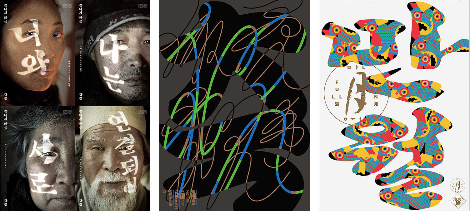
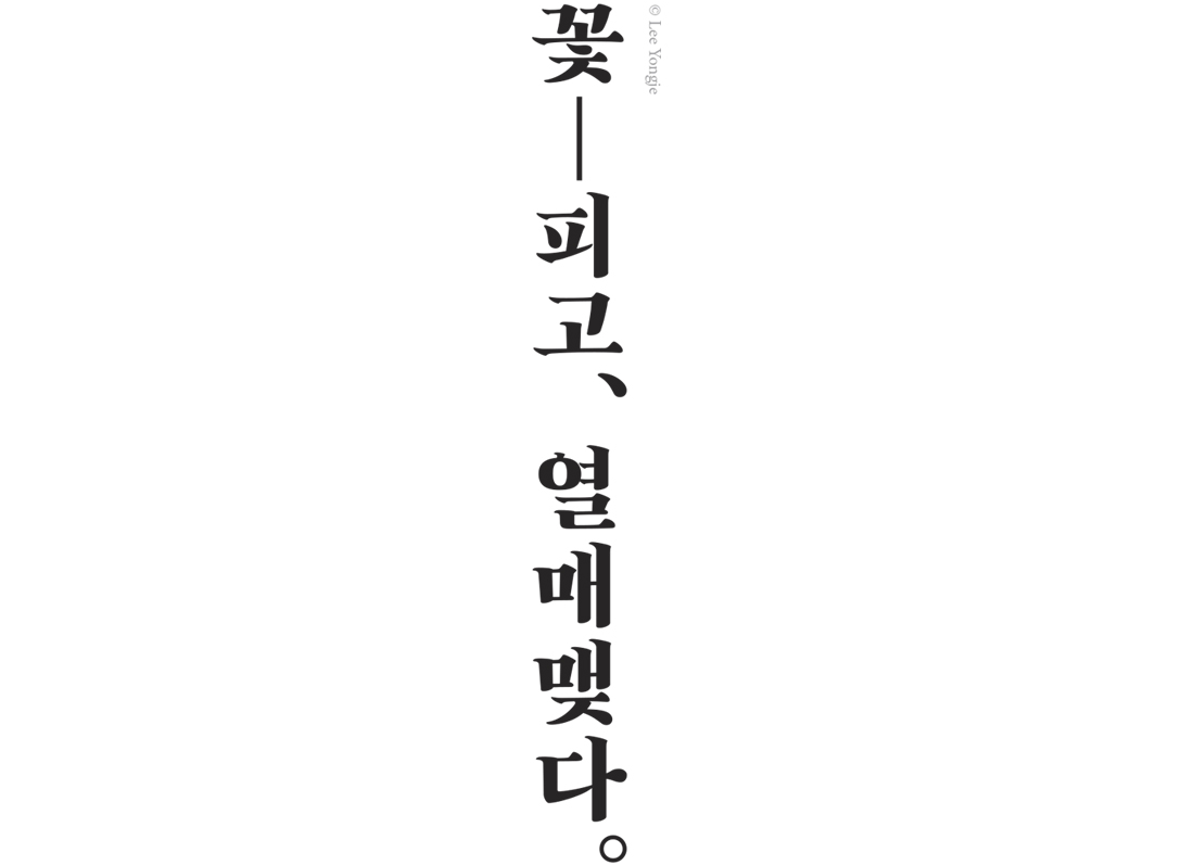
Baram-chae is Lee YongjeˇŻs iconic ˇ°wind/hopeˇ± font featured in his project ˇ°Everyday Practice.ˇ± It reads from left to right ˇ°You and I are connected to each other.ˇ± © Everyday Practice (Left), The Seoul-based graphic designer Chae Byungrok has run the company CBR Graphic since 2014, with posters a key medium for his visual experiments. Shown on the right is his 2015 work ˇ°Celebration,ˇ± representing the Korean character chuk, and on the left is ˇ°Full Moonˇ± comprising the Korean term manwol. © Chae Byungrok (Center, Right)
Epitome of Minimalism
For the above reasons plus HangeulˇŻs global debut in the form of geometric symbols through the textbook Hunminjeongeum (Proper Sounds for the Instruction of the People), geometric formation is a crucial part of the finesse of Hangeul design. Though the conciseness of HangeulˇŻs geometric lines and figures were considered a radical advance in simplicity, the term ˇ°geometricˇ± does justice to neither the alphabetˇŻs accessibility nor its minimalistic composition.
Such simplicity itself connotes a style but also a lack thereof at the same time. In other words, the rule of thumb in simplicity is to show no inclination toward a design. Simple styles are expressions of the liberty of the designer; HangeulˇŻs minimal appearance allows room for the expressions and styles of others to shine through.
Transformative Power
Design is about imagining ideals. Though everyone has their own directions or preferences, imagination can serve as a common starting point. Hangeul begins from stark simplicity and can be incorporated into structures with limitless variations. Whether written sideways or vertically or presented in font frames, Hangeul is sufficiently flexible to cater to the imagination. If approached with no preconceived notions of appearance, Hangeul has endless potential to unlock benefits never thought of before.