

Hooked on Hangeul
Labeled as a ¡°true performer of letters¡±
¡°During exhibitions of Korean typography, many non-Koreans exclaim, ¡®So graphic!¡¯ This is a natural response. The Korean alphabet Hangeul is known for its systematic design. It was created by intention. The alphabet was published in the 1440s in a document called ¡°The Proper Sounds for the Instruction of the People,¡± or the ¡°Hunminjeongeum.¡± Hangeul is the only alphabet in the world with a known team of inventors and an official proclamation date. Its birth is the very image of typography.¡±
Written by Park Ji-yeon Photographed by Studio Kenn
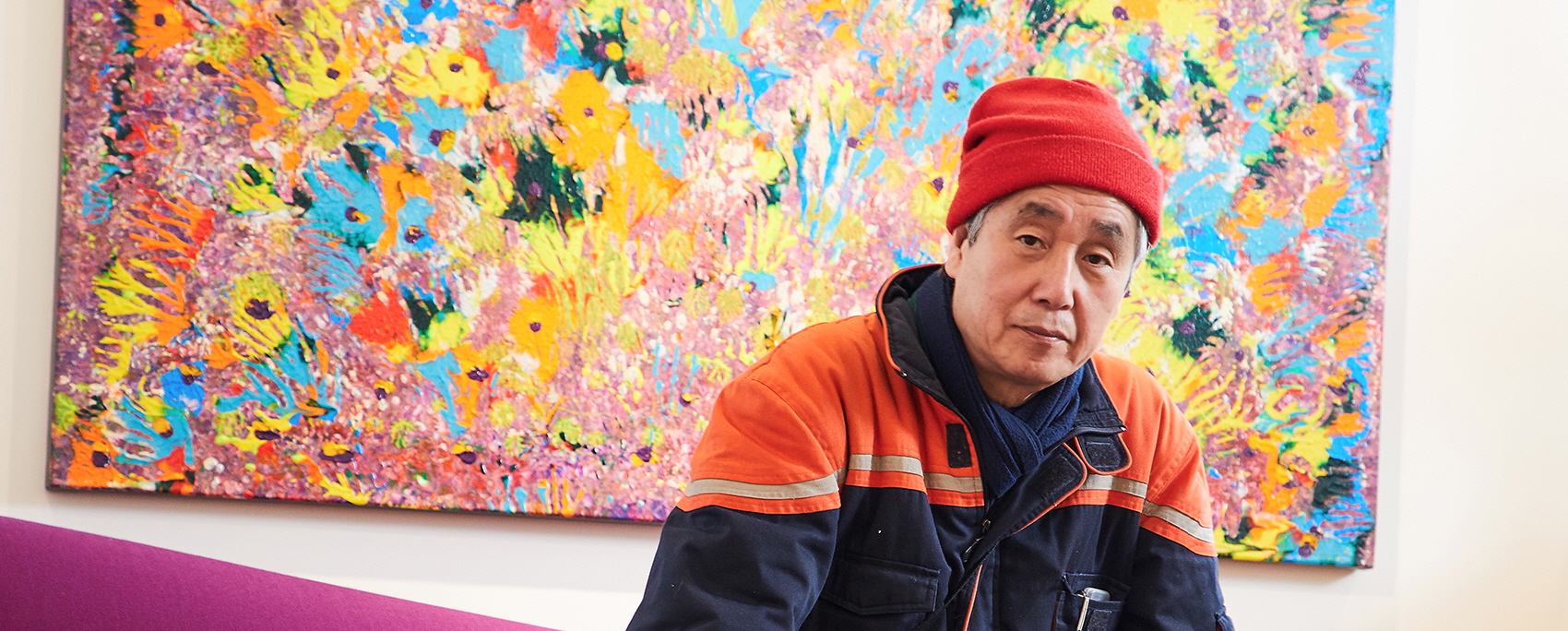
Living as a Performer of Letters
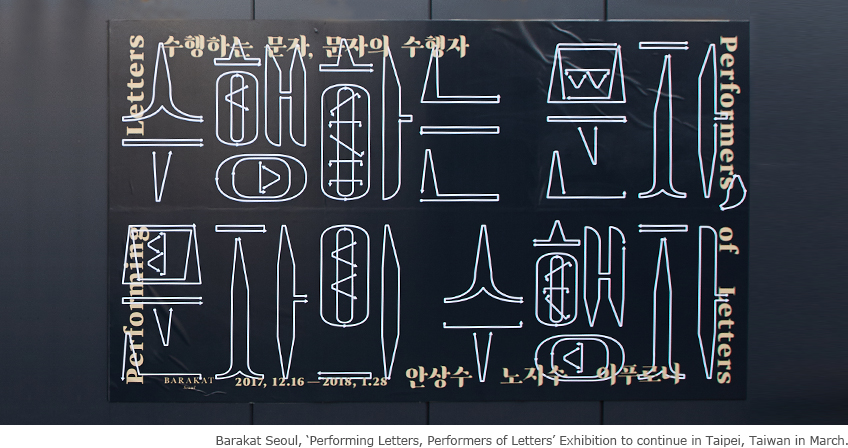
We met Ahn at one of his exhibitions, titled ¡°Performing Letters, Performers of Letters.¡± As the first of Barakat Seoul¡¯s inspiration series, the exhibition explores the relationship between ancient types of writing and contemporary typography. The world-renowned designer will also be holding an exhibition in Taiwan this March. The curator, while introducing photographs taken in places far from civilization, tells us that Ahn sought out the most remote places in the hopes of discovering original forms of letters. Labeled as a ¡°true performer of letters,¡± he constantly documents the ongoing script revolution in the form of texts and images.
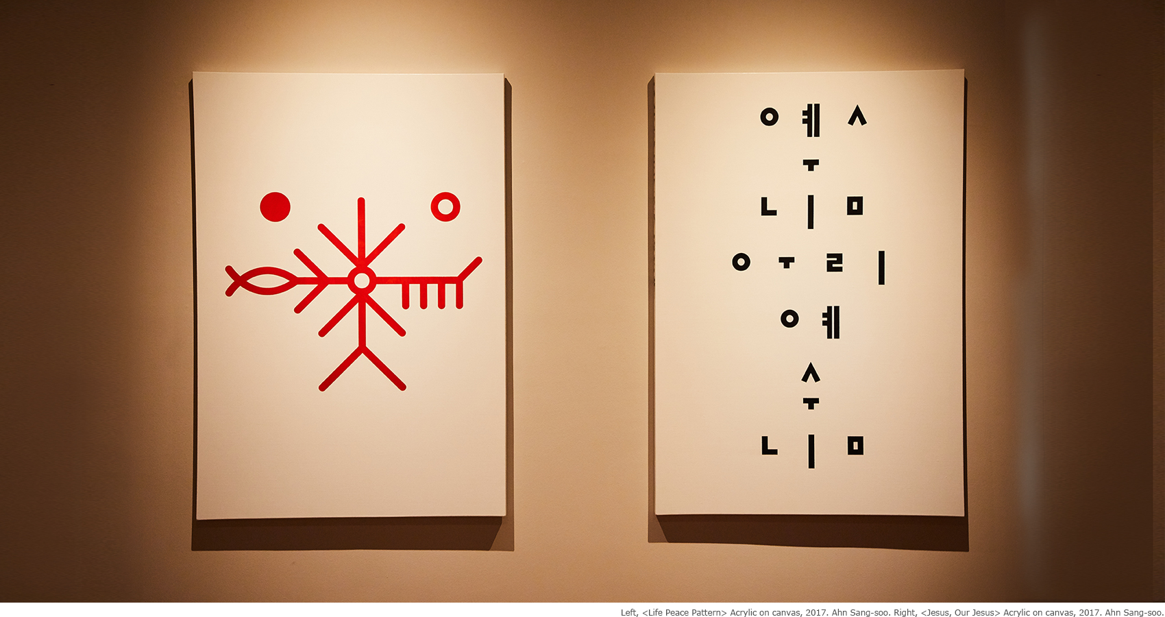
Head Over Heels for Hangeul
One question posed to Ahn, who has demonstrated innovation in the world of Korean typography, was why he chose the Hangeul alphabet. He compared it to being in a romantic relationship. We all have the experience of noticing for the first time how attractive someone is and falling head over heels in love. This is the relationship between Ahn and the Korean alphabet. Before creating the ¡°Ahn Sang-soo¡± typeface, he approached the software company Hangeul as a researcher, curious and driven. At some point, he realized that he had fallen blindly in love, or, as he puts it, ¡°possessed.¡± It filled him with immense pride to know that he belonged to a society that had invented such a remarkable alphabet. In love, he found it natural to commit and make sacrifices, no matter how busy he was. What sets Ahn apart from others is that the subject of his love is not a human, but Hangeul.
Lured by Letters :
The Fate of Typographers
While Ahn has a fondness for Hangeul, he loves letters in general. Just looking at letters from any alphabet or writing system makes him excited and motivated. When he sees an object shaped like a letter, he goes all-out to satisfy his curiosity and makes it his next destination. ¡°Letters are the key to how much of a culture can be preserved, and how much it will shine in history. The same goes for Hangeul. If Hangeul had not been invented, would Korea even exist? Korean culture may be would not have developed.¡±
Ahn is in love with the Hangeul and with other writing systems not solely because they serve as design subjects. Perhaps the word that best captures the nature of his relationship with Hangeul is the Korean word hollida, which literally means ¡°to be possessed or bewitched by something.¡± His pure passion is fueled by an unconditional love, and this is the force that drives his typographic creativity.
-
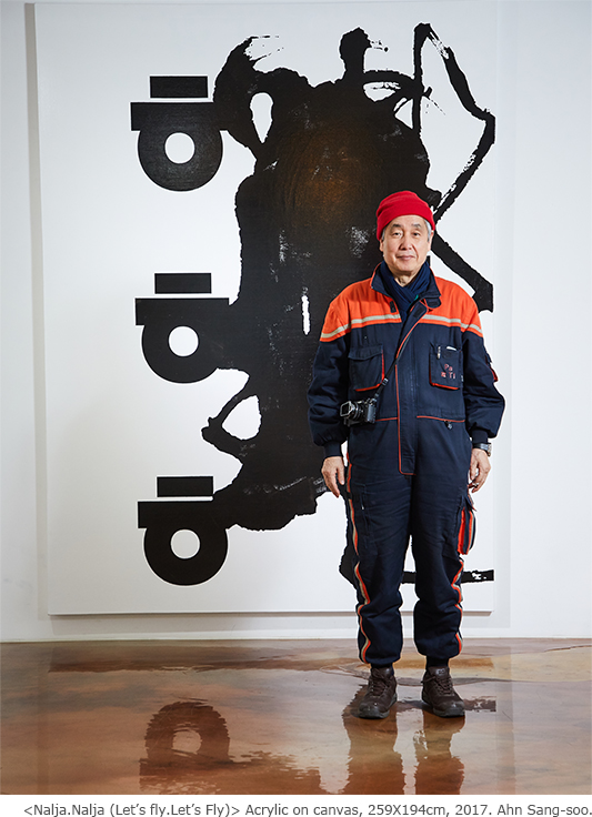
Ahn Sang-soo Profile
Visual designer(designer of Hangeul) and educator
- 1985 Invented the ¡®Ahn Sang-soo¡¯ typeface, a non square Hangeul font
- 1988 Received an award from the Korean Language Society for contributions to Hangeul design
- 2007 Received the Gutenberg Prize from the city of Leipzig, Germany
- 1991-2013 Served as a professor in the Department of Visual Design at Hongik University
- 2013 Founded the Paju Typography Institute (PaTI)
Exhibitions
- 2002 Rodin Gallery
- 2007 Leipzig Museum der Bildenden Künste
- 2013 Une Saison Graphique, hosted by the French town of Le Havre
Typography Institute,
Soaring Toward Meotjieum
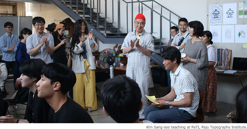
Ahn has a dream. It also happens to be that on which he is currently working. When asked if there is any experiment he would like to try, he replies that he is living the dream: teaching at the Paju Typography Institute (PaTI). At PaTI, students refer to their teachers as ¡°wings.¡± He acts as wings for his students, helping them to soar to greater heights. Ahn founded PaTI as part of his endless journey of Meotjieum, which is the Korean word for ¡°design.¡± In Ahn¡¯s own words, his learning journey can be described as ¡°a flapping of wings toward Meotjieum.¡±
¡°PaTI is a school that designs letters. It is the epitome of my fascination with the Hangeul alphabet. I don¡¯t simply teach. I share what I have learned and that in which I am most confident. After all, schools are not meant to be private possessions. I will continue to devote myself to collaborative creations.¡±
Ahn places an emphasis on inherent values when working with letters, be it inner or outer forms. Although it's hard to catch up with his past accomplishments, we have great expectations for Ahn and his future undertakings. Just as he has fallen for Hangeul, perhaps we, too, have fallen for him.
Other Article



Odaesan Mountain,
Pyeongchang¡¯s Treasure

Hooked on Hangeul
Designed To Be ¡®Held¡¯


Eomuk Fishcakes


With Culture N Tickets
Application of subscription
Sign upThe event winners
Go


